April 15th Update – New Digital Watercolours
Over the last few years I been painting Acrylics. In October 2019, as many of my friends and family are aware, I suffered my 3rd stroke in 5 years. Since then, I have been on disability as I heal. I had to take a bit of time off the acrylic painting.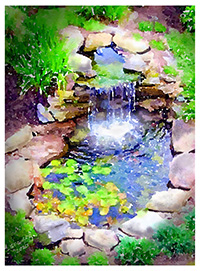
In January, I started painting again but was limited in how much I can stand or sit in one spot. Once my health improved, I would return to more acrylic and watercolour painting. So this leads to my next foray in a different style of painting. Read on.
A few years ago, I got an Apple iPad Pro and digital pencil. After my stroke in Oct 2019, I lost some more vision and struggled with balance/vertigo issues. I still fight this daily. With the COVID situation around the world and with being self-isolated at home, I started painting digitally on my iPad. Part of the reason was I could hold the iPad close to my left eye (I am totally blind now in my right eye) and paint. Although still disabled, I could paint for 30-45 mins at a time.
An average painting on an iPad takes me about 3-4 1/2 hours. About 1-2 days. My average acrylic painting takes 15-24 hrs. Based on this, using the iPad works well.
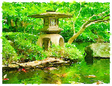
 In November 2019, the iPad program Procreate 5 came out. Included in this update, was a new custom brush editor. You could create very sophisticated oil brushes as well as watercolour and texture brushes. Creating random effects for foliage, moss, leaves and branches was very easy. Though in blending brushes for mixing oil paints or watercolours, there was little you could not build.
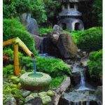
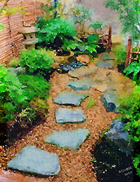
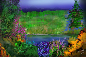
So with Procreate 5, I have been very busy painting. I still paint in acrylics but to be honest, it takes a bit longer. My plan this summer and fall are to do more watercolour garden paintings. When my Dad passed away last year, he left me his art supplies and watercolour paper, so I am set to paint more as I heal.
So… I have received a lot of emails about how I paint. My goal is to share and help others learn as I get better. I am assembling an e-book to sell/promote online in addition to videos demonstrating how it’s done. So some tips in this post will be included along with sample images and video training.
Digital Painting Tips
- Most of my paintings start with a neutral colour, rather than just a white canvas. If it’s a warm picture with warm colours (browns, red, orange etc) I use a tan coloured background. If its a painting with cool colours (blues, greens, purple) I will use a blue or dark blue/black background.
- The secret to any good digital painting is as follows:
- Start by blocking in solid colours rather than any detail.
- As know in advance what direction your light source or sun is. Is it up high on the right or low in the centre or left. This is important.
- When painting natural items like plants or grass, trees, don’t line everything up. Throw in big leaves, dead leaves, small to large leaves etc. Nature is not 100% perfect. The human eye can trick you into thinking you do certain patterns.
- Understand basic colour theory. Complementary colours (ex: blue and orange, green and red, purple and yellow) work well together.
- Shadows – life and the nature of light ensures shadows are a part of any painting. Most new artists paint shadows as black. But the majority in real life are dark and often a complementary colour in some capacity.
- Light reflects off of nature or manmade items. So a blue house when sun hits it will reflect blue on the ground in some cases. In a forest or garden, light reflected off plants will have a green tinge or cast.
- Understand a shade of a colour versus a colour tint. This is important to learn. Don’t alway add white to lighten a colour, it can wash it out. You can mix other colours to make it appear lighter.
- Understand / research additive colour, subtractive colour and opacity. Great concepts to learn. I will give you an example: If you want to paint an watercolour on paper painting of a bush, you might start with the lightest colours and white first and then layer darker colours. On a digital painting with opaque colours, you might start a bush with blacks or dark greens and then layer lighter opaque colours on top.
- When creating digital watercolour paintings, fill the page with colour, then later you can go back in and add white “spots” between colours. The purpose is to make it appear that the white “watercolour paper” is showing through. Rarely do you see a real watercolour painting with no white. White highlights draw you in.
- Last tip of this post – Remember mountains, buildings, tree lines viewed at a distance are less saturated, lighter based on atmospheric perspective. Understanding atmospheric perspective adds realism. At a distance, certain natural items or buildings have a blue tinge. This is based on light reflectivity at a distance.
Anyway, these tips are just the beginning. There is a lot you can learn. And I hope to post more and with pictures and video.
Have a safe and healthy week. Stay isolated but safe!
Cheers
Gordon